So it's your first week in a new design role, what do you do? What should you have prepared? Here are 10 ways to set yourself up for success.

One of my biggest struggles starting out in Product Design was the ability to make consistent color palettes. Creating typography and color palettes that worked within product constraints without sacrificing recognizability on countless screens. I needed a reliable way to experiment with composition without ditching pre-existing styles and screens. Using different shades of grays, sacrificing accessibility, and not knowing when or how to use colors without a strict system in place was frustrating and limiting.
After a long time of experiencing this frustration, once I started learning to code a few years ago things clicked for me. I could use opacity! With opacity, I could blend layers of elements together and still maintain a harmonious color palette, build more accessible products, experiment with layout more, and take another problem off my plate to think through.

Using in Product Design Practice
Using different shades of grays with determined hex codes can lead to poor contrasts between elements and leave interfaces inconsistent, inaccessible for some users, and even just plain ugly sometimes. Instead, I found using a pure white and a pure black (or with a tiny amount of hue if you’d like!) as a starting point and taking advantage of opacity to be a much better tactic. This makes it much easier to develop color palettes, design systems, product iterations, and work better (and quicker!) towards product goals.
Not making sense yet? No worries! Here’s a visual:
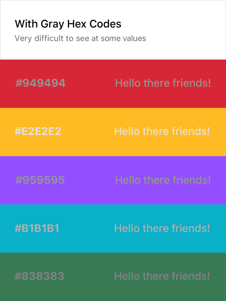
As you can see, the usual approach on the left makes it quite difficult to consistently create text that is legible without using a pure white or black on top of the color or having a very specific and well-maintained system in place. Both of these solutions are tedious and hard to implement across teams and passing off to developers.
Setting Typography Rules for Color in Product Design
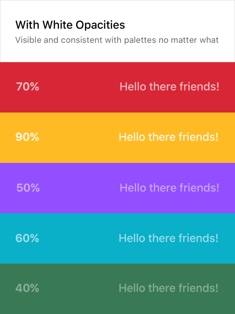
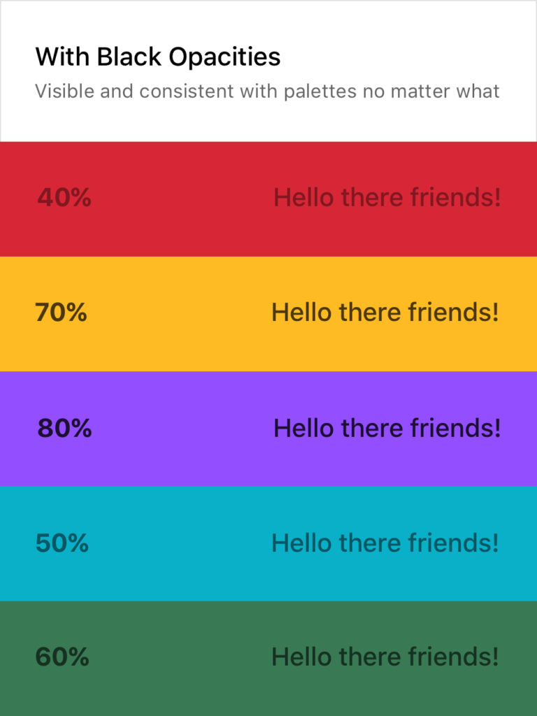
The white and black opacity approaches on the right are consistently legible and don’t require verbose rules and guides to follow. Although the ones above are random, I usually stick to 20%, 40%, 60%, 80%, and 100%, giving each their specific use case. This dwindles the amount of rules to remember down quite a bit and still provides enough flexibility to build a system around them while promoting experimentation in screen layouts and UX decisions.
Of course, there are still limitations here. Some of the examples above could do with a higher or lower opacity to make them 100% AAA compliant. For example, you wouldn’t want to put 20% white text on top of a yellow color or a 80% black text on top of a dark purple. It’s important to keep those in mind as well, but this post is more to provide a basis for building a better system, not so much a cheat sheet and an answer to everything.
If you want a real-life example, my personal website (https://www.cortes.us) is built entirely with different opacities of white and black for text mixed with colors throughout.
What About Passing to Developers?
Okay so now you may be asking yourself how you can communicate this system with a developer and how it would work in code. It’s actually quite simple! Luckily for you, both mobile (yes, native too) and web technologies support an RGBA function as a way to specify color values. How does this work? Here’s a little key and example:
rgba(230,18,75,0.5);

// the first 3 numbers are your R, G, and B values (0 - 256).
// the last digit is the alpha, or opacity in our case
  // pass in a decimal number equal to the opacity you want


// EXAMPLES

// For a black at 5% opacity
color: rgba(0,0,0,0.05);

// For a white at 80% opacity
color: rgba(256,256,256,0.8);
And voilà! You can create a key very simply for developers like you normally would with a style sheet of some sort, just exchange hex codes for RGBA function values for your neutral colors. I’d also recommend creating a guide around when and where to use certain opacities (40% black with uppercase text at .875rem for secondary titles for example).

As of when I am writing this, I am starting my first day at my new job tomorrow. I’ll be starting as a Product Designer at Dave, a financial tech company based in Los Angeles.
While looking for the next place to call home for my work life, culture was one of the biggest deciding factors for me. I believe that working with folks you can also call your friends outside of a work setting makes for the best outcome and work ethic at a company.
However, outside of culture, I was also looking for a role that was slightly out of my grasp and knowledge of prior experience. I was looking for something unfamiliar and that I hadn’t yet mastered. I’ve learned over my time in the industry that the best way to stay happy and challenged at a job is to work on things you haven’t had the exact experience with. It keeps you on your toes, keeps you learning, and keeps you yearning to get even better at what you do. You quickly realize you aren’t a master at your field, yet you can be a master at managing and improving how you approach each of these unique experiences.
Dave for me was a great step in the right direction for my career. At Dave I’ll be working on designing the future of finance as someone who has never designed specifically for this field, and for a change my job won’t only rely on what is looked at on screens. I’ll be working on designing real life experiences from brand to packaging and more. On top of that, I’m the first designer to be full-time at the company besides the CPO. As a result I’ll be working on developing a process around how design works with other parts of the company and probably even hiring and leading other designers as we begin to grow the team.
How this applies to your career and how you work can go many different ways, but I think the overall guidance of looking for something you feel confident yet unfamiliar with is a good place to start. The exciting part of life are the times we apply ourselves to overcome new obstacles, leading to a better you. Having the foundational skills for the job to rely on while using the rest of your skillset to learn and adapt I have found to be the best teacher in life, no matter how many mentors I have or books I read.

Since joining MetaLab a few months ago, I’ve had to transition back into daily stand-ups after not having them since I worked at Satchel last year. While stand-ups are incredibly useful in a work setting, it definitely takes some preparation and getting used to or can lead to miscommunication or even be action-less at the end.
Here are some tips I’ve implemented for myself that you may find useful for your own standup preparation:
Write down tasks you complete throughout the day
At first I thought I could remember off the top of my head everything that I did the day before but I was completely wrong. Some days I would forget a few tasks that were completed and would jeopardize deadlines or personal task lists.
Instead, I now keep a notebook next to me throughout the day at my desk and I write down each tasks I finish that day no matter how big or how small the task is. Then the next day I have an accurate list ready to go and talk through with my team.
Write down specific blockers you had during the day
Sometimes I’ll have some software issues during the day (cough InVision cough) that can put an hour or so dent into my workday. Or sometimes I’ll be waiting for another task to be completed by another team member before I can proceed. Addressing these blockers in stand-ups is crucial to be transparent with your team and your team may have advice on how to better approach these blockers next time you face them.
Leave stand-ups with clear action items
Ever leave a stand-up and need to think for a second about what actually needs to get done? No, just me? All joking aside, this is an obvious but important one. Make sure you have a clear picture of the goals for your tasks that day and what needs to get done for that day. It helps!
Ask for prioritization of tasks for that day
A genuine mistake I used to make was not asking for prioritization of tasks. Some tasks needed to be done before others for client presentations or calls so it was important to put those first.
Not asking for priority level on tasks can lead to interference with the schedule and tasks of others which you definitely don’t want to be the cause of. Prioritizing your tasks for the day also allows for some leeway if not every task gets done because you got the most important ones out of the way at least.

© 2012 - 2024