Ihave been struggling quite a bit lately coming to terms with the various interests and pursuits I have in life. Feels like a strange statement to say if I’m being honest—how can being passionate about different topics have a negative connotation?
Well, there are a few that I personally struggle with and have a hard time overcoming, but I think the main ones being incompletion, lack of focus, and the feeling of accomplishment.
Let me tell you my scenario and maybe you can relate.
An overview of topics I am passionate about in no particular order: design, development, music, music production, fashion, sneakers, startups, health and fitness, entrepreneurship, gaming, minimalism, interior design, collecting, and writing. Not a crazy amount of topics to be interested in all things considered, but with my personality and mentality it leads to some “less than ideal” situations for me.
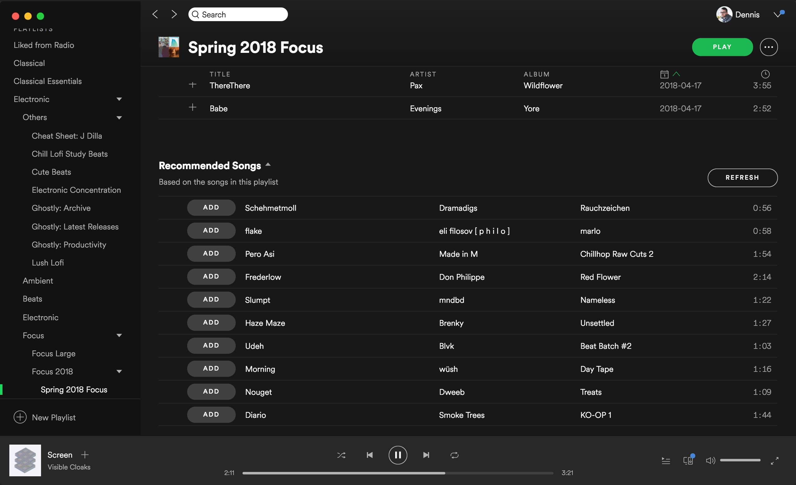
I love making things. I feel like crap if I’m not working on something (a side project, a new album, etc.) and in turn weigh “journey” over completion subconsciously. This leads to unfinished projects, songs, books, articles, video games, etc. I get a rush over starting something new and learning about new things at a constant pace.
If something starts to feel mundane, I need to move onto something else or I get extremely unmotivated. Being unmotivated = no work being done = me feeling like crap and getting in my head about things and where I am in life. Dramatic, right? I agree, but it isn’t something I can control unfortunately. I’ve recently found this compounding as I’ve shifted more of my personal work outside of full-time design work towards non design and development topics.
For example, being focused on releasing mini-albums (or EPs), playing story focused games with time investment peaking, and recently getting into fashion and streetwear and the research and collecting that comes with it. While I don’t regret putting time or money into these (on the contrary, I highly enjoy them), my time spreads more and more thin for making time to pursue my original goals in my career of design and development.
I want to work for myself at some point in the future. I love where I work now and don’t plan on doing this anytime soon, but some day. I want to have my own web apps that I work on myself and just have that as my full-time job. While I consider myself a great designer and front-end developer, I don’t quite have the full skillset to pursue this or even put this into motion. While I’m more than willing to learn, it’s hard to find a balance with all the other things I’m working on and doing.
At some point there is a priority decision that needs to be made, whether consciously or not, and wherever my interests are focused at the time tends to be the winner. So instead of learning some new technologies of code or picking up and reading that business book, I’m putting that time into working on my new album or researching a company or project I came across.
One could argue that I need to “set my priorities straight”, and while I thought this was the case too, it’s a bit more complicated than that after much reflection. It’s not that working on my new album or playing a video game aren’t priorities to me, because they are. I care about making music and experiencing an interactive movie because these are creative outlets for me outside of design and development too.
These other topics I care about are important to me and it’s not just a toggle to switch of what I want to do that day. Throughout the week I touch on almost all of my passions to a degree, and I don’t want to have to sacrifice one or two of them for others. I have instead been pursuing each on a typically shallow level while deep diving on 1–2 at a time.
What I’m trying to say is that no matter what I do, I always feel guilty about another topic that I’m not working on. Even when I am working on one and being productive, in the back of my head I’m asking myself “when are you going to finish that code course?” or “how come you haven’t finished that book yet?” or “you only have one song left for that EP, why are you doing this instead?” as an endless loop.
While I’ve come to terms with struggle to an extent, every now and then it becomes overwhelming mentally. As someone who keeps to themselves and does well with handling problems on my own, it’s a tough thing to talk about with others because there really isn’t a straightforward answer. It’s more of a fluctuating choice management of focusing on 1–2 topics for a finite amount of time and then when my mind shifts, I let it and ignore other topics for a bit.
I’m getting better at feeling less guilty putting other interests on the back burner for a bit and learning how to handle it more and more each day, but it was something I wanted to write about this week as it’s very relevant to me today recently as couple things in life start to compound one another for a bit.
Did this make sense? And is it something you or someone you know can relate to? I’d love to know your thoughts and/or your approach to this if you have any input you would like to share as it’s always welcome.


